Warp · Design system · Live
Lumen.
I built Warp's design system on my own, and directed the AI that wrote most of the code. What's mine is the problem, the visual language, and every judgment call. The AI did the typing.
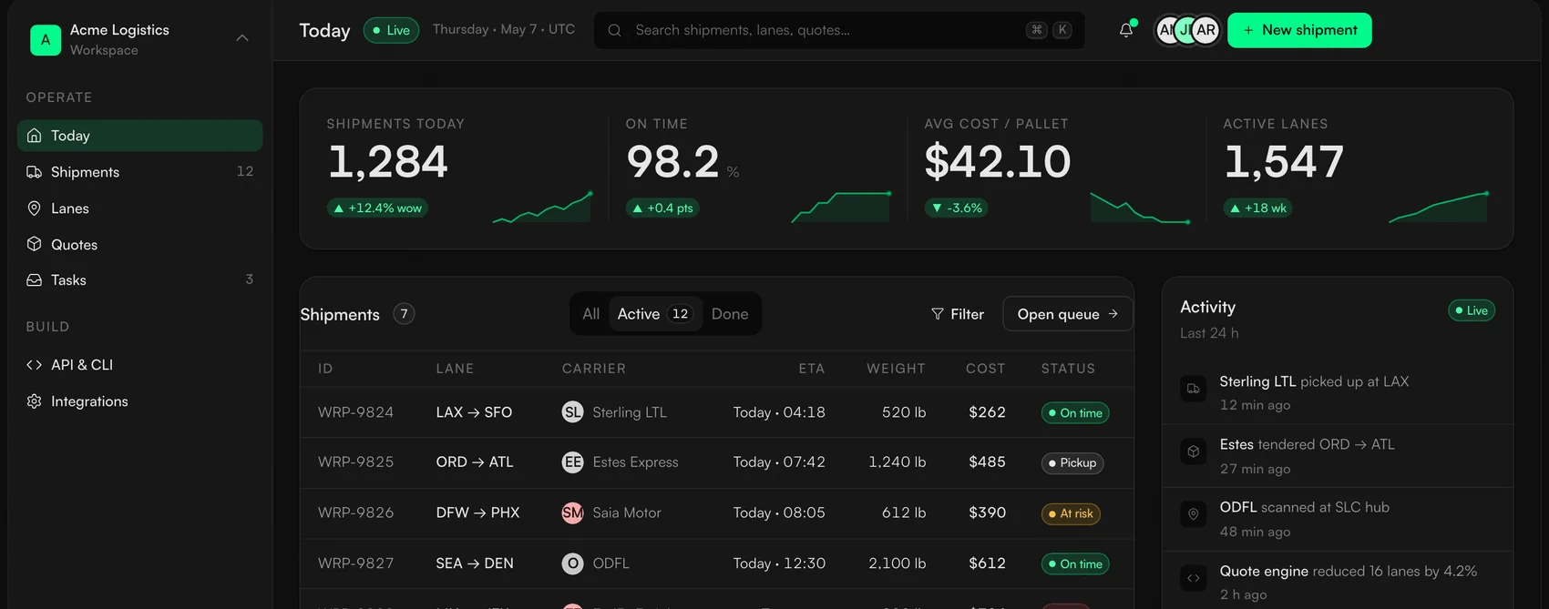
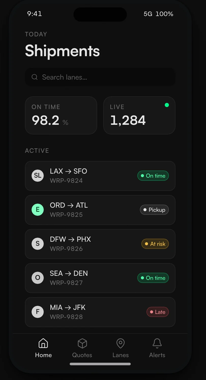
Warp ships fast, with a small team, across a lot of product and marketing surfaces. Each one had drifted into its own look. When I audited our transactional emails, I found three design systems running at once, with three different shades of brand green. Lumen makes them one, and it is built to be read by the AI agents writing most of the code, not only by people.
Built solo, with the AI doing the typing. These are the size of the system, not a claim about its impact.
Three ways the same brand kept coming apart.
Warp had a brand: a loud green and a dark, dense operator feel. What it did not have was the layer that turns a brand into a system, the part that makes every screen agree with the next one.
The audit · transactional email Three CTAs, three greens
One brand, three greens, in the same channel. #4ADE80 was Warp's accent lime and #22C55E its success green; #00FA8A is the Spring Green they were unified into. A diagram of the real finding, drawn from Warp's own brand values, not a screenshot.
I stopped choosing between clean and dense.
The brief asked for Apple: clean, minimal, Ive and Rams. Warp's real character is a freight Bloomberg terminal, dark and dense and full of live numbers. Those are not opposites. They live at different layers, so I stopped choosing and started stacking them.
A 1.25 modular type scale, tight tracking on display. A 4-point base on an 8-point soft grid. Hairlines carry separation, and shadows are reserved for UI that genuinely floats. Motion decelerates and stays under 200 milliseconds.
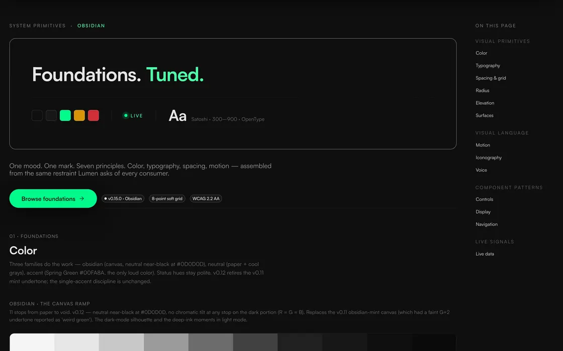
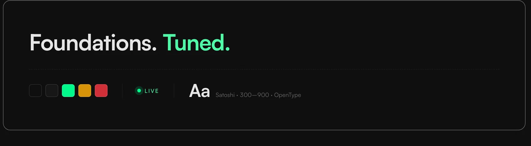
An Obsidian #0D0D0D canvas, neutral where red equals green equals blue. Spring Green #00FA8A, one role only. Satoshi for every job, its tabular figures carrying the numbers, no second font.
A palette kept small on purpose.
Three families of color, one typeface, one grid. A single accent only reads as loud when nothing around it competes, so I gave it nothing to compete with.
Color Drawn from the real token ramps
The dark stops are a true neutral, red equals green equals blue, so nothing tints the canvas green. The accent was retuned from the old Warp lime to #00FA8A; the discipline, one hue in one role, is the part that was mine.
Spring Green was already Warp's brand color, used hundreds of times in the code before me. My part was the discipline. It means action, live, or success, and it appears nowhere else on the surface.
One variable family carries interface, display, body, and numerals, at weights 300 to 900. The monospaced feel on numbers comes from OpenType features on that same face, so there is no second font. That one call cut four families to one.
Type · Satoshi Set live, in the face it describes
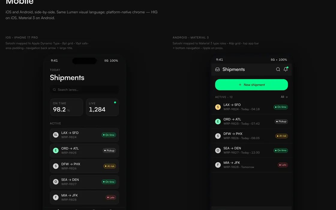
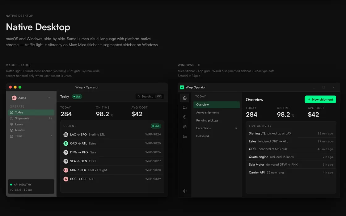
Honest about coverage. The tokens and the consumption guides reach all nine targets. The native component examples are a partial proof of concept so far, not nine finished apps.
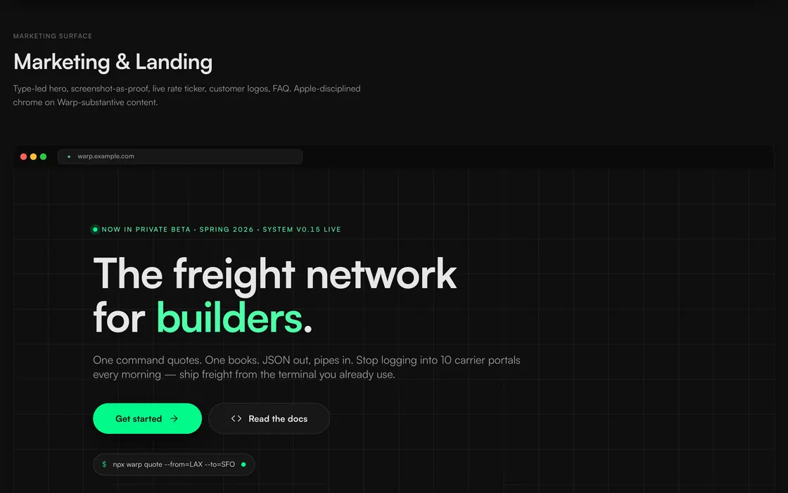
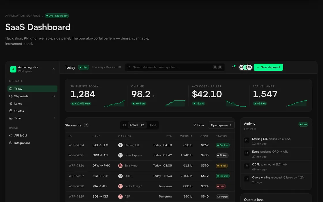
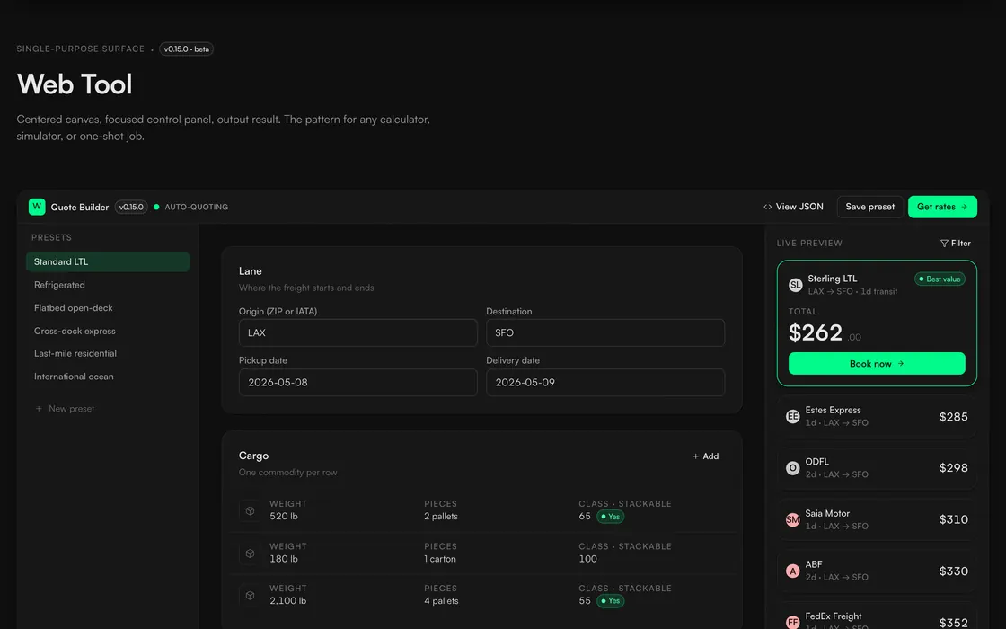
Eight surfaces that answer one question.
Each template is the canonical answer to "is this how a Lumen surface looks?", from marketing breath all the way to operator dense.
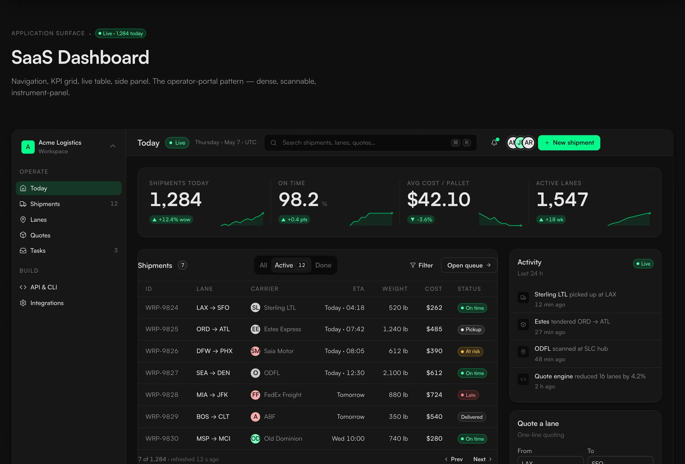
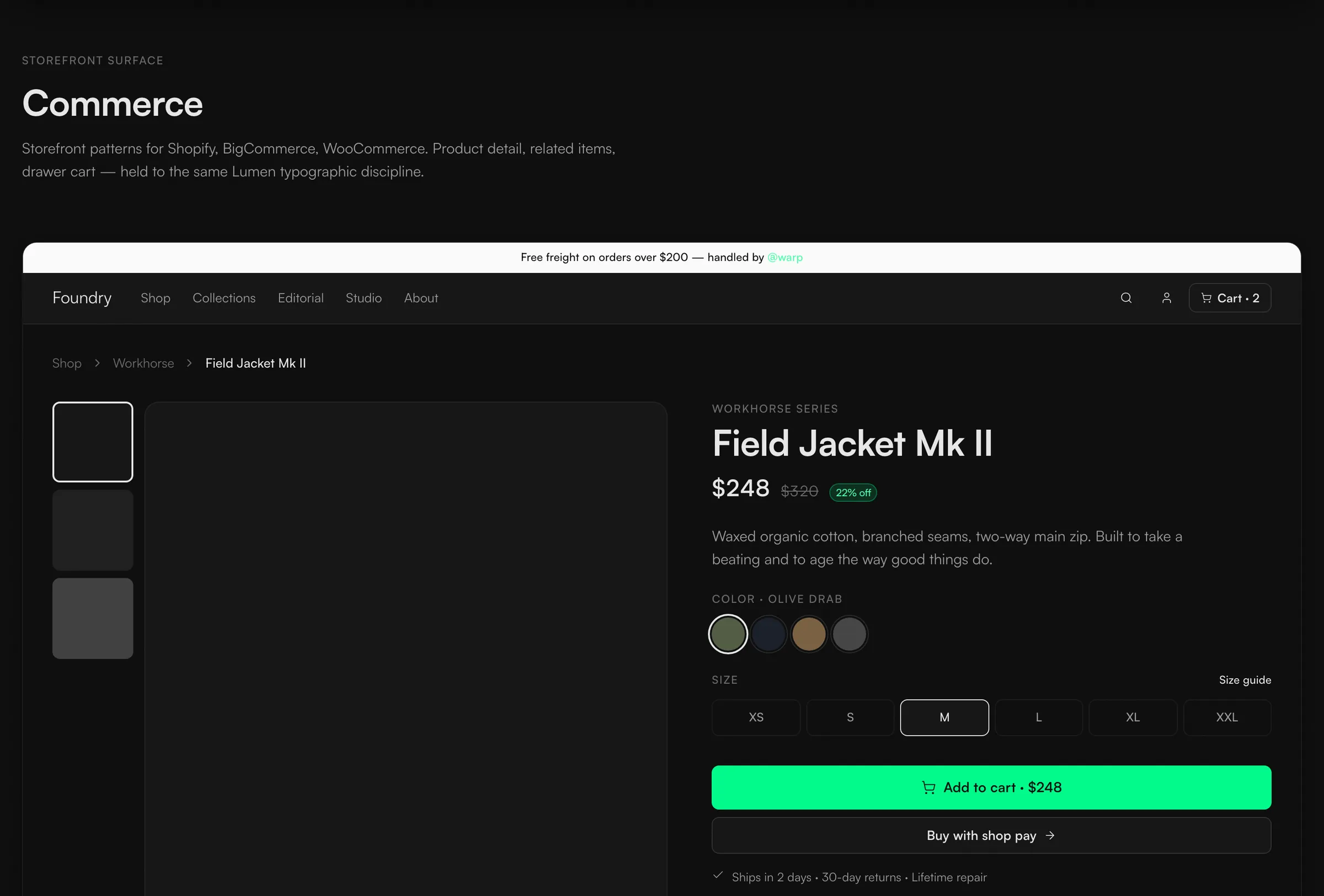
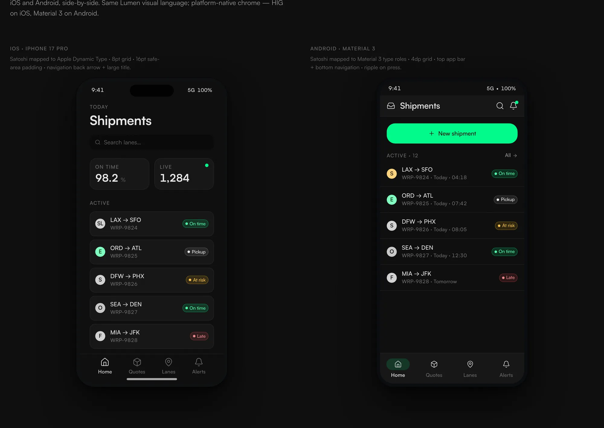
Documentation an agent can follow tightly.
Most design systems are documentation that engineers translate into code. Lumen flips it. The schema is the source, and every AI tool gets a contract it can read in its own format.
A component.md with anatomy, usage, motion, and accessibility that a designer reads directly. A component.json the shadcn registry installs from. They are kept in lockstep, so the prose and the schema never drift apart.
An llms.txt for discovery, an AGENTS.md for the universal rules, then tool-specific files for Claude, Cursor, and Warp. All of them mirror one source, and the rules are enforced by lint.
The component contract Two files, kept in lockstep by CI
The .md is what a designer reads; the .json is what the shadcn registry installs from. Every AI tool gets the same rules in the format it reads natively, and a lint fails the build when the prose and the schema drift apart. Both panels are abbreviated from the real button/component.json and .md, in their own field shape.
Bugs hide from the same kind of looking.
Most systems drift because they lean on people remembering the rules. I replaced that with checks the build runs on its own. Each round added a new kind of measurement, and a new kind of measurement is what kept surfacing a new class of bug.
Guard · contrast ADR 0035 · the bug that wrote its own lint
My own operator tool shipped 1.66:1 text on green across eleven or more sites, because a developer reached for a token name that did not exist and it fell through quietly. I added the token, a defensive component, a build-failing check, and a doc. On its first run the check caught the same bug hiding in Lumen's own example code.
Guard · elevation ADR 0030 · I overruled my own system
I had built an internally consistent rule that allowed green in a button's halo, then reviewed it against the live product and decided colored light reads cheaper than a clean surface. So I overruled my own system, broadened the lint to fail the build on any green shadow, and shipped the code, the docs, and the amended rule in one commit. The whole page you are reading obeys it.
A rule you have to remember is a rule that decays.One check on the tokens, one on the prose, because neither can see the other.
A number, a live dot, a rate ticker.
An operator sees three small pieces of Lumen far more than any button. That is where the operator-console feeling comes from, so they got most of the polish.
The three signatures Where the operator mood lives
Coherence and defects prevented, not a dollar figure.
Lumen is live, and it runs real work. Our operator tool is built on it, and the team's AI agents read from it directly. What it does not have is an adoption chart or a revenue line, and I am not going to draw one.
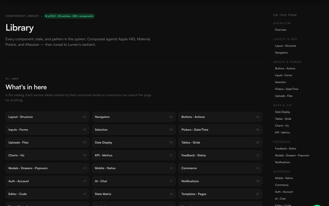
- The size of the system, all built solo with the AI doing the typing: 900+ design tokens, 98 component contracts, 9 emit targets, and 35 written decision records.
- A 16-round audit where I changed the measurement each round instead of re-walking the same screens. It kept finding a new class of bug.
- On the reference build Lab: page load down about 31 percent, layout shift at zero, and zero unnamed controls across 714 interactive elements. Lab numbers, and I label them that way.
- The contrast bug my own tool shipped, fixed at the system level from 1.66:1 to 14.7:1 across every affected site.
- Adoption numbers. Real adoption is our tool running on it and the agents reading from it, not a count across all of Warp.
- Revenue or conversion. This is internal platform work. It buys coherence and prevents defects, and I do not get to invent a dollar figure for that.
The honest value here is coherence that holds on a shrinking team, and defects caught before they ship. That is what a design system is for, and it is the part worth judging.
Vigilance is the wrong currency for consistency.